Sunday, October 24, 2010

Heritage City, Flash Mob


The flash mob conducted in Heritage City. 

About 30 people participated in this mob. We sang and danced and ran around the spaces trying to activate it, engage people around and show them that the space can be used for a number of different activities. The scales of the space, both vertical and horizontal show how uncomfortable the space is and thus this flash mob proved to have no significant impact on the residents / people around the area.


A few pictures of the flash mob: 


The area as it normally is.


Urban Gorillaz!


During the flash mob.


This photo here shows the relative scale and the intimidating, uncomfortable feeling of being in this space.


Aayushi Malik
II-A


HERITAGE CITY ,GURGAON -harshat verma

HERITAGE CITY PLAN


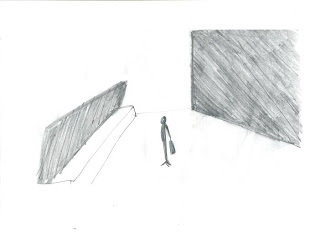
TWO POINT PERSPECTIVE OF THE BUILDING

THE DRAWING DEPICTS THE PROPORTION OF PEOPLE IN RESPECT TO THE BUILDINGS AROUND.


SCALE OF THIS AREA MAKES IT A VERY INTIMIDATING SPACE.
WITH  BALCONIES RUNNING AROUND EACH FLOOR , PEOPLE WALKING BELOW FEEL THAT THEY ARE ON DISPLAY ALL THE TIME . THE SCALE OF THESE BUILDINGS MAKES THE AREA ISOLATED AND VISUALLY DISCONNECTED FROM THE ADJACENT PARTS .


PHYSICAL AND VISUAL ACCESS TO THE AREA


ACCESSIBILITY
THE VARIOUS ARCHITECTURAL ELEMENTS CREATE HINDRANCE IN THE MOVEMENT OF PEOPLE
AND ALSO ACT AS VISUAL BARRIERS.THE ONLY THINGS COMING IN VIEW FOR A PERSON WALKING PAST ARE GENERATORS,SKYLIGHTS AND RAMPS LEADING TO THE BASEMENT PARKING.
THE SPACE BEING SURROUNDED BY THE 4 BUILDINGS IS COMPLETELY OVERSEEN DUE TO LACK OF ANY LEVEL DIFFERENCE IN THIS AREA.
THE PLANTS ENCIRCLING THE AREA AGAIN RESTRICT PEOPLE TO ENTER THE CENTRAL CIRCLE .


MOVEMENT PATTERN


  MOVEMENT -

   
THE CIRCULAR ARROW REPRESENTS THE MOVEMENT OF SKATERS  IN THE AREA.
THE DASHED ARROWS SHOWS THE MOVEMENT OF THE CARS .
CURVED ARROWS SHOWS THE MOVEMENT PATTERNS ON THE PEDESTRIANS.
THE SPACE IS USED ONLY AS A THOROUGHFARE, BECAUSE THERE IS NOTHING IN THE AREA THAT INTRIGUES PEOPLE TO STOP AND INTERACT, IN SPITE OF HAVING SO MUCH POTENTIAL. KIDS BELOW 12-13 DON’T FEEL SAFE HERE TO PLAY AS IT IS COMPLETELY CEMENTED,THUS THERE IS ALWAYS OF A CHANCE OF YOU GETTING HURT.

THE VARIOUS ARCHITECTURAL ELEMENTS PLACED HERE HAVE UNCONSCIOUSLY CREATED A PATH WHICH PEOPLE HAVE TO FOLLOW,LEAVING A LOT OF SPACES AROUND THE BUILDING UNUSED.

WHATEVER LITTLE MOVEMENT HAPPENENS,IT LEAVES NO IMPACT .

Saturday, October 23, 2010

Accessibility
Looking at the red movement pattern inculcating the pedestrian movements accounts for a high density of people
The vehicles are limited to their drop offs represented in blue
Pedestrians are provided with walkways through the building
Observations: the area in the middle is left open with no movement around
The movement of the people are with the form of the building
Another problem with the area is that on entering people don’t know where to go , it has a large space in the middle creating a feeling of ambiguity
The movement of the people are with the form of the building
It basically shows that people have this tendency of following the form that is directing them towards their building. They like moving against the wall because it acts as a directing tool.
Solution :The place requires a network that could direct them from one building to another also forming a link
                                                      Levels
Yellow – 0 level
Dark blue - +3 level
Blue - +2 level
Observations :People have this tendency to walk on the +2 level as all the entrances are at the same level
It was observed that to take an easy way out they avoid levels even if it is a shortcut to reach to the other end
Three sides of the +3 levels haven’t been provided with steps making it inaccessible from three sides
On walking from one end to another through the level are
as it was observed that if a person is travelling he has to go down two steps and come up two steps applying double the energy
Solution- steps are an obstruction to the design and restricts movement  through that area
                                                                              MATERIALITY
Observations :The biggest problem with this area is that when people enter the structure area and the depressed area ,    they feel excluded and isolated from the movement going on in the adjacent areas the landscaping creates an visual barrier  throughout

The benches which are placed next to the structure create a clumsy space which isn’t really suitable for walking on as it gives a feeling of claustrophobia and confusion.
       And the green masses which are placed in the middle, blocks the view of the person as shown in the picture.
      The pictorial representation of trees appearing to be red at the ends depicts that they are acting as barriers for the movement of the people and also block the view of the person
All these barriers act as visual as well as physical hindrances
As it was observed that about 60 -70 walk through that area everyday which is quite less as compared to the total population that the complex holds
The levels further add to it
Solution- the area needs to be landscaped again and all the material barriers need to be taken into account
                              MOVEMENT PATTERN ON A DAILY ROUTINE      
Observations :Red –  high density area - highly active -majority of people walk on this patch
       Blue – low density-least active- nobody walks on this area or the density of people is very low at this particular place
         Yellow- moderately dense- moderately active-  medium activity happening in this area

The materiality and levels acts as barriers creating low density regions in the structure area
The human tendency of taking a calm long route over a claustrophobic and confusing route comes into play making the red region highly dense
One problem that people face is that the red region provides an obvious route but the area through the structure is not very obvious on the contrary it is  complex
Solution – provision of an obvious route that connects the entrances and is also short.
                               MOVEMENT PATTERN DURING FLASH MOB
Observations: Red –  high density area - highly active -majority of people walk on this patch
     Blue – low density-least active- nobody walks on this area or the density of people is very low at this particular place
Urban gorillaz placed themselves near the entrance as it proved to be an active zone due to the regular in and out movement of the people
The building entrances were not very active as the various plants and trees  created visual hindrances hence blocking their view and restricting them from seeing the flash mobs
conclusion- the area near the complex entrances were highly active and those near the building entrances were not that active.

-SHITIJ DOGRA

Diagramming And Analysis- Unitech Cyber Park, Gurgaon

SITE - UNITECH CYBER PARK, GURGAON
PURPOSE - OFFICE BUILDING


SITE MAP- UNITECH CYBER PARK


AIM - TO STUDY THE GIVEN PUBLIC SPACE AND ANALYSE WHETHER THE SPACE IS BEING USED TO IT'S MAXIMUM POTENTIAL.

PROBLEM - THE OPEN SPACE BETWEEN THE TWO OFFICE BUILDINGS REMAINS INACTIVE MOST OF THE TIMES DURING THE DAY, CREATING A VOID IN THE CENTRE. WHEREAS, THE REMAINING AREA SURROUNDING THESE TWO BUILDINGS REMAIN COMPARATIVELY HIGHLY ACTIVE.

REASONS

  1. ACCESSIBILITY

THERE IS NO DEFINITE PATH DIRECTING THE MOVEMENT OF PEOPLE TOWARDS THIS OPEN CENTRAL SPACE, HENCE PEOPLE DIRECTLY ENTER THE OFFICE BUILDING.


ACCESSIBILITY


       2.  MOVEMENT OF PEOPLE

PEOPLE FOLLOW A CIRCULAR MOVEMENT PATTERN AND REMAIN CONFINED TO THE OFFICE BUILDING EDGES BY CREATING A VOID IN THE CENTRE DUE TO -

  • LEVEL DIFFERENCE
  1. THE RANDOM PLACEMENT OF STEPS AROUND THE STRUCTURE (DOTTED), PEOPLE AVOID THE SWITCHING OF LEVELS AND MOVE AROUND THAT STRUCTURE TO GO FROM BUILDING TO THE OTHER.
  2. SCATTERED BENCHES SPREAD ALL OVER, DIFFICULTY IN WALKING THROUGH.
  3. LACK OF CLEAR VISIBILITY DUE TO-
  •  THE HUGE STRUCTURE (DOTTED) IN THE CENTRE OF THE OPEN SPACE.
  • LONG PLANTERS SCATTERED AROUND THE SPACE.


WHEREAS THE REMAINING AREAS ARE FLAT, WITH NO LEVEL DIFFERENCE AS SUCH.


LEVELS AFFECTING THE MOVEMENT OF PEOPLE


  • LACK OF SHADE AND SEATING ARRANGEMENT
1. THOUGH BENCHES ARE PROVIDED IN THE CENTRAL SPACE AROUND THE STRUCTURE, THERE IS NO PROPER SHADING.


2. THOUGH THE STRUCTURE IS FULLY COVERED, WITH PROPER SHADING, IT IS HARDLY ACTIVATED DUE TO LACK OF PROPER SEATING.

HENCE, PEOPLE REMAIN CONFINED TO THE CORRIDORS LEAVING THE OPEN CENTRAL SPACE INACTIVE.

TIME SLOT 1


GENERAL MOVEMENT OF PEOPLE AND HEAT DIAGRAM
TIME- 1:30 TO 3 PM


TIME SLOT 2


HEAT DIAGRAM
TIME - 6 TO 7 PM


CONCLUSION  - THOUGH PEOPLE CAME OUT IN THE OPEN DURING THE EVENING, STILL THERE WERE HARDLY ANY PEOPLE USING THE STRUCTURE.


AT THE TIME OF THE FLASH MOB
TIME- 1:30 TO 2:30 PM


MOVEMENT PATTERN AND DEMOGRAPHIC RESPONSE OF THE PUBLIC

INITIAL MOVEMENT PATTERN OF PEOPLE REMAINED THE SAME AS ANY OTHER WORKING DAY DUE TO-


  • THE STRUCTURE PLACED AT THE CENTRE IN THE OPEN SPACE BLOCKED THE VIEW OF THE PEOPLE FROM ALL THE SIDES.
  • THE FLASH MOB MEMBERS BECAME NOTICEABLE ONLY FOR ABOUT 5 TO 10 MINUTES, WHEN PEOPLE DEVIATED FROM THE GENERAL MOVEMENT PATTERN.


PRAGYA VIJ

HERITAGE CITY (Gurgaon) - Diagramming and analysis - smriti chauhan

HERITAGE CITY, a residential complex in Gurgaon was the ground for one of the flash mobs that we conducted.
 
The general picture of the blocks, is of high rise apartments ( height-12 floors) enclosing a courtyard, with each block having separate greens.


The particular block, where we conducted the flash mob was the courtyard - 37m x 37m flat cemented ground, with parking and a seating surrounded by few potted plants - between blocks 18, 21,14 and 17.


SITE MAP

scale - 1:100


 my observation of the problems with the space

1.  not being used for an engaging activity except thouroughfare


2. if used at all, then used for skating in the evening (around 6:00 pm, an occupancy of 5-6 people)


Feeding information from the flash mob, for analysis I start by comparing the site given above and its surrounding areas (which draw in a larger population - given the fact that both sites are enclosures with certain ammenities)
                                                                                 
                                                                                   
SITE FOR FLASH MOB - site 1
AREAS SURROUNDING THE SITE - site 2
Why  people don't come out and play/sit/engage in  any other activity out here, given this huge enclosed    area? What stops them from coming here and  propels them to occupy the surroundings ?.
                                                                                 
   MATERIALITY of the two sites is the first reason that comes across.

SITE 1  The flat cemented ground, sure provides facility for children to skate, but absence of greens stops them to willingly come out and enjoy.

SITE 2 Green fields, with a dense cover of trees, shading the adjacent roads, creates a pleasant atmosphere, drawing in people, leaving site 1 unused.


HEIGHT DIFFERENCE

 SITE 1  Another reason , i feel, is the huge vertical gap -the feeling of, being in constant view of people all around, adds to the discomfort of people.

SITE 2  whereas in case of the surrounding areas, elements like trees (say 3m high) break the vertical difference - enabling people to relate to human scale.


also talking about ACCESS

SITE 1  access to the buildings is from outside so that even in case of entering the block, encounter with the courtyard space is eliminated

SITE 2  and the greens surrounding the outer periphery further lead on to the other larger field clearly outside the courtyard space, further compelling people to ignore site 1.


and access to the surrounding greens, points out the main reason for site1 being used merely as thoroughfare, one needs to access the fields so cross over the space existing and ignore it completely. If it was to be used only as a thoroughfare, then why the need of such a huge area ???

I feel, with a courtyard geometry and perfect visual and physical access it has the potential for social/cultural intermingling (and reflecting back, courtyards are designed for such purposes ) .
Why design a space in such a fashion and reduce it to a mere thoroughfare?? ( It is sheer wastage of space and  elimination, of what could have been a high level social interaction.)


Friday, October 22, 2010

Documentation and Analysis of MGF Mall: Shivani Sharma


Vehicular and pedestrian movement


Because of the unspecified and undistinguished path of the vehicular and pedestrian traffic there is a lot of chaos in the orange shaded areas which is not healthy for the people crossing the area.


picture 1:vehicular and pedestrian movement 
red arrows: vehicular movement
blue lines: pedestrian movement
orange areas: areas having head on collision of pedestrian and vehicular traffic.
NOTE : no specified path for pedestrian traffic.


  • Heat Chart : normal timings


This place is only used for movement as people find no reason to stay. Yellow areas are the left  over spaces which are not used by the people like blocked and unreconstructed service lane, grass patch not allowed by the mall authority as they maintain it.


picture 2: heat chart at normal timings
red: most populated areas
orange : medium populated
yellow: negligible population


                                                             Heat Chart: During flash mob

By doing flash mob at 4 different points a reason was given to the people for staying in the place. But still people were only attracted to the pavement in front of metro station but not to the unmaintained service lane.


picture 3: heat chart at the time of flash mob
red : most populated areas ( place of flash mob)
red dotted: areas from where people are attracted towards flash mob area.


Pshychological reaction

People from the metro station stopped in the place to participate in the flashmob  but people going to MGF Mall were curious to know whats happening but still did not stop because according to them the space would


 be too exclusive.picture 4: psychological reaction during flash mob
blue dots: site of activity during flash mob
pink lines : people only visually involved.
blue lines: people who actually came and participated by painting the structure.
NOTE: only people from metro station participated


Problematic Areas


After the study and analysis these are the areas which need to be improved upon to actually give a reason for all the stratas of society to use the space.

green: unused green spaces
brown: muddy service lane baricated by mgf mall authority.
yellow: muddy patch left 
red :head on collision of vehicular and pedestrian traffic ( no particular path for pedestrian people)
blue: con-justed entrance ( no recognizable entrance)
NOTE: even no shade and no seating 


Analysis of Unitech Cyberpark : Amrita Kaur Matharu

                                                          STUDY OF PUBLIC SPACE


        Public Space: Unitech Cyberpark
       Type of public space: Official


There are two areas in Unitech Cyberpark which attract people and movement . The two spaces are vastly different yet interconnected. The effectiveness of the two spaces will be analysed on the basis of  movement levels and seating.

AREA 1: The courtyard
                                                           Movement in area 1
Movement Pattern in Area 2 largely follows the contours of the space. The space in the centre is void.
Causes of this pattern are:

  •  lack of clear visibility across level differences  due to visual and physical obstructions.
.


  • people prefer to sit on the long planters provide along the edge of level difference .


Conclusion: Space is not fully being utilized and the centre remains a void.

AREA 2: The outer passage
                                                  Movement in area 2


Movement Pattern: The movement pattern here also does follow the contour of the building. However there is no wastage of space due to this fixed pattern flow.
Causes of this pattern are:

  • Clear visibility across space due to lack of obstructions across a level surface.


  • People still do prefer to sit on the long planters . However the placement of planters encourages movement in the full space.


Conclusion:
The space is being fully utilized with no wastage of space.


Amrita Kaur Matharu